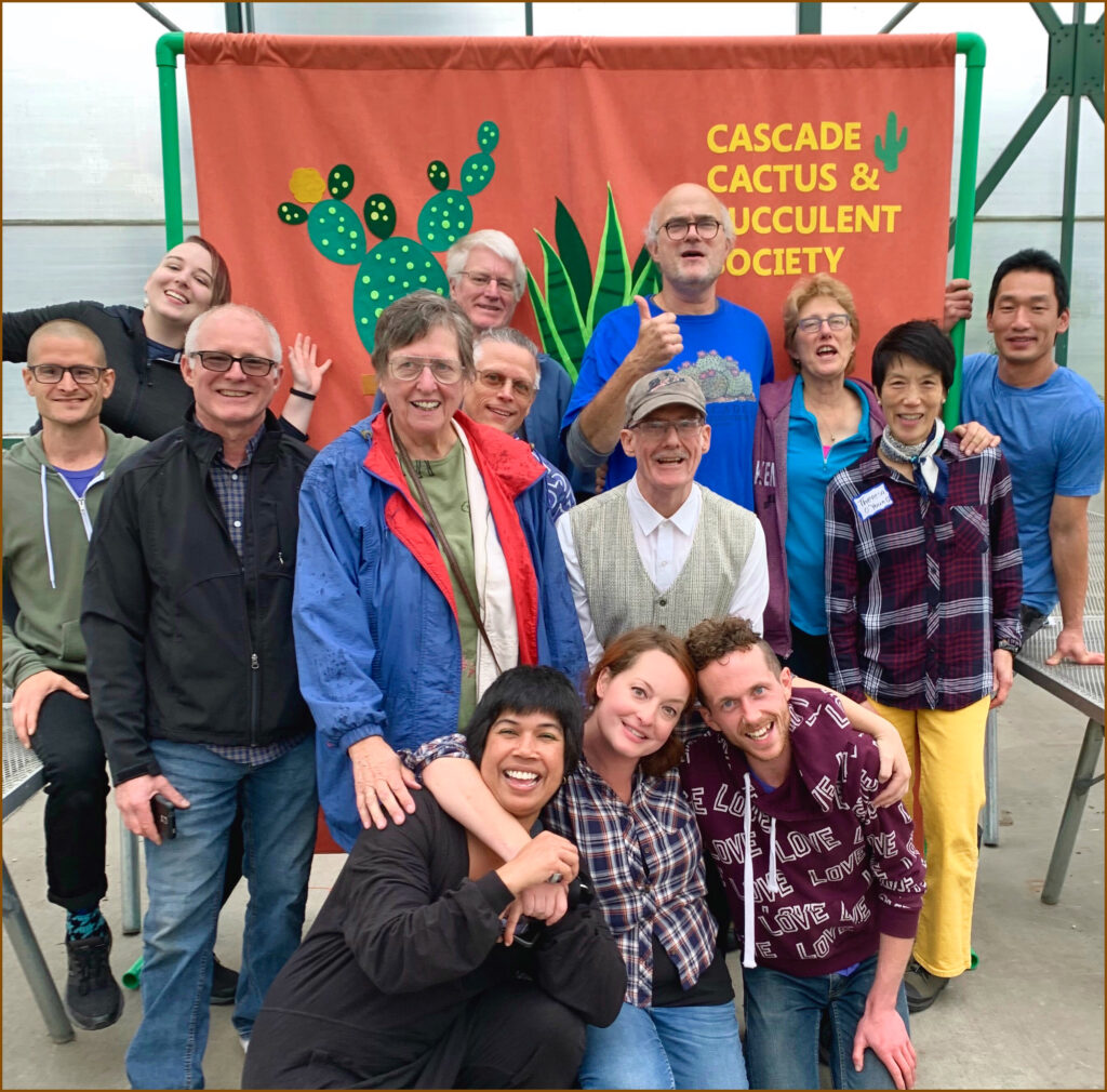
CSS Navigational Headings

Different background colors have been applied to each navigational heading and each list of links underneath each heading. A background color has been applied to the <h1> heading containing the page’s title, the body of the dinner menu itself, and the <h6> heading containing the page’s footer. I’ve already covered the background-color property fairly extensively in previous chapters, but here’s a review of the most important modifications made to the menu_system.css style sheet. The following shows how these modifications impact the presentation of the web page.

The first modification to the menu_system.css style sheet is made to give each heading a light blue background color.

div#nav > ul > li {
background-color: lightblue;
padding: 0.5em;

Uncategorized

Floating Inline Elements and the Inline Box Model

The final rule for floated elements is that they’re always treated like block elements. Inline elements like or allow some box model properties such as margin, borders, and padding to be applied. Inline elements, however, do not allow dimensional properties such as width and height to be applied. This is understandable because these properties are expected to be contained in the flow of text. The element is an exception because it allows dimensional properties to be applied. Elements like the element are known as replaced inline elements, and elements like and are known as non-replaced inline elements. Replaced inline elements are replaced by something—for example the element is replaced by the image referenced via the src attribute. After the float property is applied to an element, it doesn’t matter if the original element was an inline element or a replaced inline element because a floated element is a block element.

Uncategorized

How CSS works?

Though still quite crude, with the addition of these properties, the design is beginning to take on a more definitive shape. The goal of these additions is to put as few constraints on the design as possible so that the design adapts fluidly to the user’s environment. Although I could have utilized the minimum and maximum properties, I decided to go with a different approach to achieve a liquid design. As you may have noticed in this and previous examples, I have used the em unit to specify all lengths. The use of em units, if you recall from previous lessons, makes each measurement dependent on the value of the font-size property.

For this design, I also specified font sizes using the em unit, which makes the entire design dependent on the user’s font size preferences, while preserving the aesthetic intent of the page. If you increase or decrease Mozilla’s font size setting, the design of the JT’s dinner menu scales fluidly with that design, including the images! For each image, I also use images slightly larger than I need so that the design scales gracefully, leaving little possibility of artifacts appearing in the JPEG images. Here is a brief reiteration of each modification and why it was made. The rule that I included in the base_styles.css style sheet sets a size constraint on the

element with a body id name:

div#body {
width: 50em;
}

Uncategorized